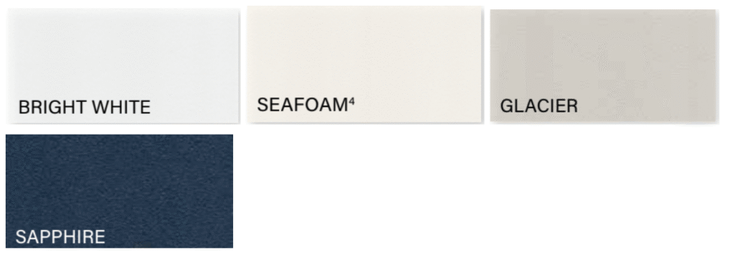
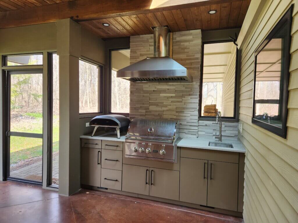
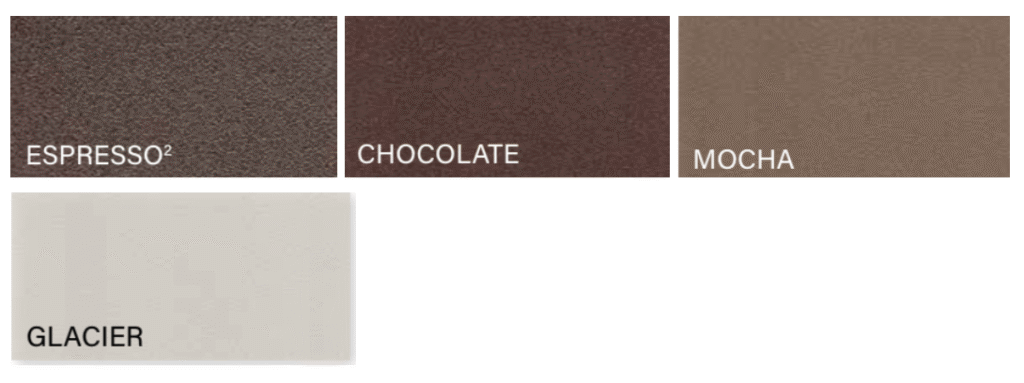
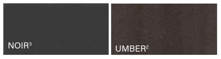
Designing your dream outdoor patio is an exciting venture for any homeowner. Once your layout is finalized, the next step is choosing a 2026-ready color scheme that brings the whole space to life, from cabinetry and countertops to decor and lighting. Werever makes it easy to match nearly any aesthetic with more than 15 designer matte finish colors and woodgrain textures, so you can go bold, soft, grounded, coastal, modern, or timeless, without sacrificing durability.
Below are the most relevant patio and outdoor kitchen color directions for all of your design inspiration and needs.
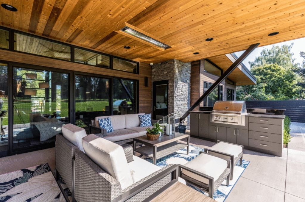
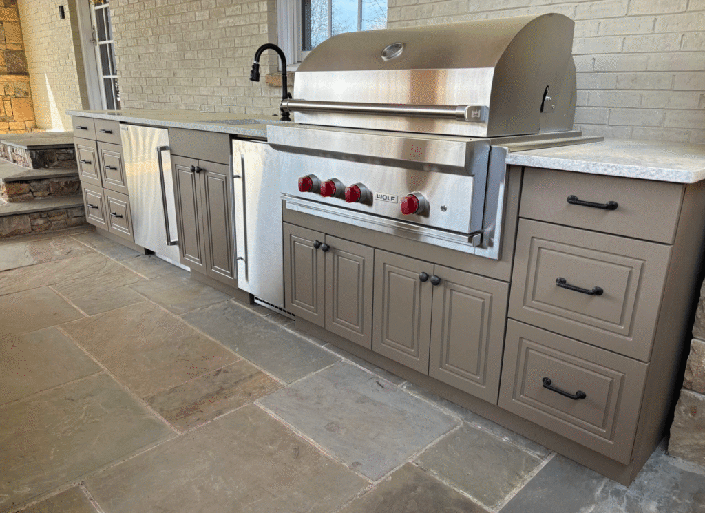
Moody Modern
TEXTURE:
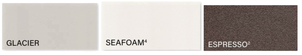
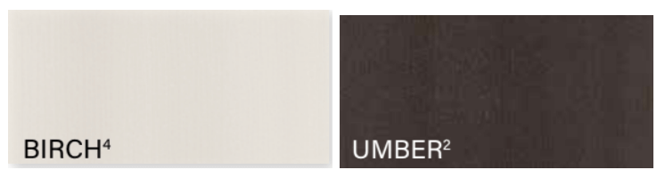
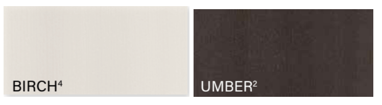
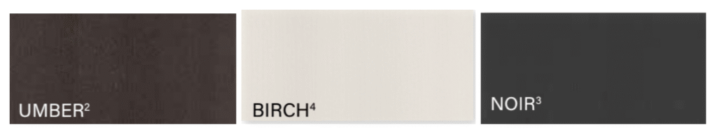
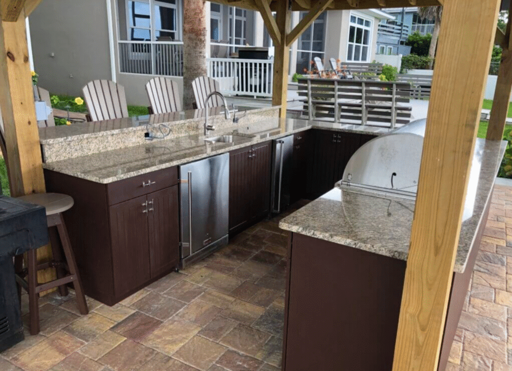
Dark outdoor kitchens aren’t going anywhere in 2026; they’re evolving. This year’s take is less “all-black-everything” and more layered charcoal, graphite, espresso, and deep woodgrain paired with warm metals, statement lighting, and textured stone.
Why it works:
Dark cabinetry hides everyday wear and mess (a big win for families and frequent hosts), and it instantly gives an outdoor kitchen that tailored, architectural feel.
Warm Minimalism
TEXTURE:
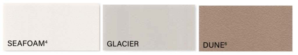
Neutrals are still a go-to, but 2026 neutrals are warmer and softer than the cool grays of years past. Think cashmere, dune, creamy off-whites, and driftwood-inspired woodgrain—easy to decorate, calm in bright sun, and timeless against greenery.
Why it works:
Neutral palettes make the decorating process effortless. You can change cushions, rugs, and accessories seasonally without the patio ever feeling “off.”
Quiet Luxury
TEXTURE:
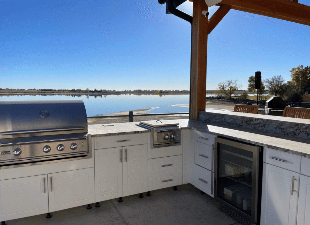
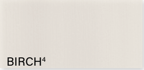
Bright, airy kitchens are a major 2026 look, especially when they’re done with texture (not just plain white). Think: Bright White cabinetry, warm lighting, stone with movement, and natural accents (wood, woven seating, ceramic planters).
Why it works:
This scheme makes patios feel larger, cleaner, and resort-like. And with today’s outdoor fabrics and performance materials, the “too risky” fear is less of a deal-breaker.
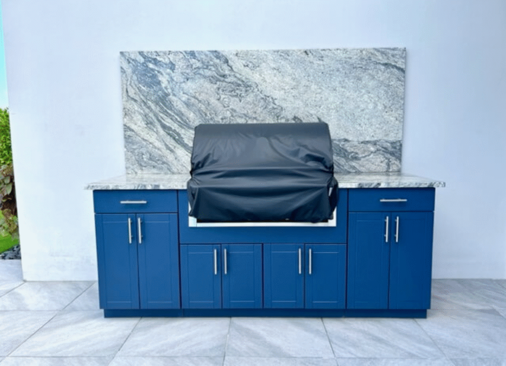
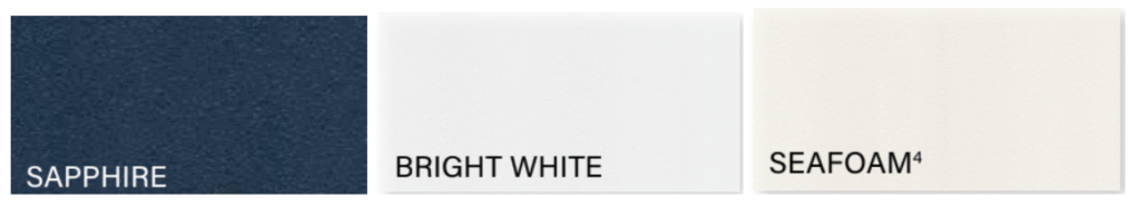
Coastal Pop
TEXTURE:
Coastal isn’t just navy-and-white anymore. In 2026, the coastal trend shifts toward saturated blues and “vacation tones” that feel intentional, not themed. A deep blue island or blue base cabinets can anchor an entire patio design.
Why it works:
Blue delivers an instant “cooling” visual effect, perfect for hot climates and poolside patios, while still feeling upscale when paired with the right textures.
Refined Nature
TEXTURE:
Cool tones in 2026 lean organic, not icy. Instead of sharp blues and purples, you’ll see more green-forward palettes and softened blue accents inspired by landscapes: coastal horizons, forest greens, and stone grays.
Why it works:
This direction blends seamlessly with outdoor surroundings and feels instantly calming, especially in backyards with mature trees, natural stone, or water features.
Desert Modern + Sunset Accents
TEXTURE:
Warm tones are back in a big way for 2026, especially in sunny regions where patios are used year-round. Instead of loud primary colors, the trend is earthy warmth: terracotta accents, bronze metals, sandy textiles, and cabinets that feel sun-baked and grounded.
Why it works:
Warm color schemes create a welcoming glow at night and look amazing with fire features, bistro lighting, and natural stone.
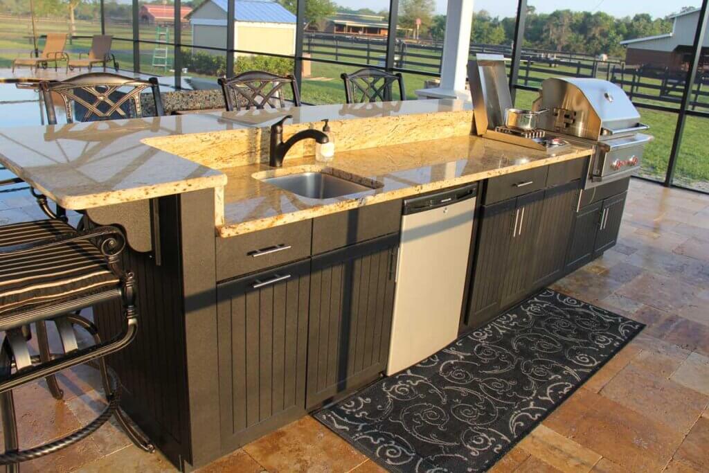
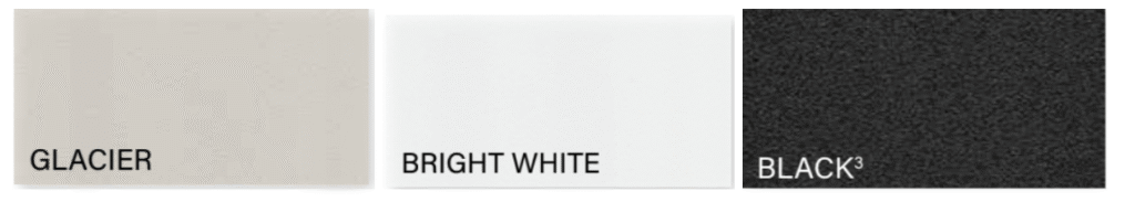
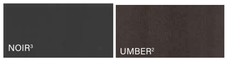
Color That Holds Up Outdoors
Choosing the right color scheme truly elevates your patio, style-wise and functionally. Werever cabinetry is made from HDPE, which is UV-protected against fading, won’t chalk like PVC, and is colored throughout the material (so it stays looking sharp over time). All matte finish colors are offered at the same price, while woodgrain texture faces are available as an upgrade.
Material colors will vary depending on your screen. Please request a material sample to see the exact color in your project space.